Make responsive UI with Jetpack compose multiplatform
import androidx.compose.foundation.background
import androidx.compose.foundation.layout.Column
import androidx.compose.foundation.layout.ColumnScope
import androidx.compose.foundation.layout.Row
import androidx.compose.foundation.layout.RowScope
import androidx.compose.foundation.layout.Spacer
import androidx.compose.foundation.layout.fillMaxSize
import androidx.compose.foundation.layout.padding
import androidx.compose.foundation.layout.size
import androidx.compose.material3.Text
import androidx.compose.material3.adaptive.currentWindowAdaptiveInfo
import androidx.compose.runtime.Composable
import androidx.compose.ui.Modifier
import androidx.compose.ui.graphics.Color
import androidx.compose.ui.text.TextStyle
import androidx.compose.ui.unit.dp
import androidx.compose.ui.unit.sp
import org.jetbrains.compose.ui.tooling.preview.Preview
enum class ScreenSize {
COMPACT,
MEDIUM,
EXPANDED
}
/**
* Determine screen size based on width breakpoints.
* Works for Android, Desktop, and iOS (Compose Multiplatform).
*/
@Composable
fun getScreenSize(
compactMax: Int = 600,
mediumMax: Int = 840
): ScreenSize {
val adaptiveInfo = currentWindowAdaptiveInfo()
val minWidthDp = adaptiveInfo.windowSizeClass.minWidthDp
return when {
minWidthDp <= compactMax -> ScreenSize.COMPACT
minWidthDp <= mediumMax -> ScreenSize.MEDIUM
else -> ScreenSize.EXPANDED
}
}
/**
* True if the screen is considered small (COMPACT).
*/
@Composable
fun isSmallScreen(): Boolean = getScreenSize() == ScreenSize.COMPACT
/**
* Flexible responsive layout.
* If screen is small → uses Column.
* If screen is medium/large → uses Row.
*/
@Composable
fun ResponsiveLayout(
modifier: Modifier = Modifier,
row: @Composable RowScope.() -> Unit,
column: @Composable ColumnScope.() -> Unit
) {
val screen = getScreenSize()
if (screen == ScreenSize.COMPACT) {
Column(modifier = modifier) {
column()
}
} else {
Row(modifier = modifier) {
row()
}
}
}
/**
* Auto layout: same content in Row (wide screens) or Column (small screens).
*/
@Composable
fun AutoResponsiveLayout(
modifier: Modifier = Modifier,
content: @Composable () -> Unit
) {
val screen = getScreenSize()
if (screen == ScreenSize.COMPACT) {
Column(modifier = modifier) {
content()
}
} else {
Row(modifier = modifier) {
content()
}
}
}
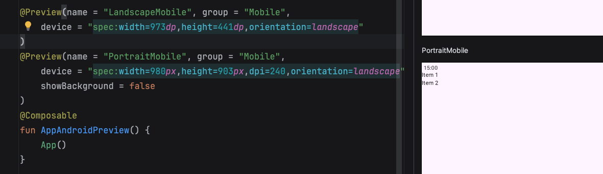
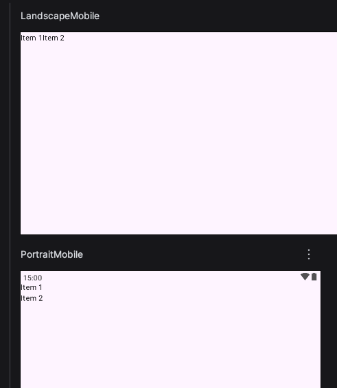
@Composable
@Preview
fun TestResponsivePreview() {
AutoResponsiveLayout(
modifier = Modifier
.fillMaxSize()
.background(Color.LightGray)
.padding(16.dp)
) {
Text("Item 1", style = TextStyle(fontSize = 20.sp))
Spacer(modifier = Modifier.size(8.dp))
Text("Item 2", style = TextStyle(fontSize = 20.sp))
}
// ResponsiveLayout(
// row = {
// Text("Item 1")
// Text("Item 2")
// },
// column = {
// Text("Item 1")
// Text("Item 2")
// }
// )
}Use the code to make your responsive UI for Jetpack compose or compose multiplatform UI.
Its easy and straight forward.
How to use? See the preview section in the code. There are 2 examples.